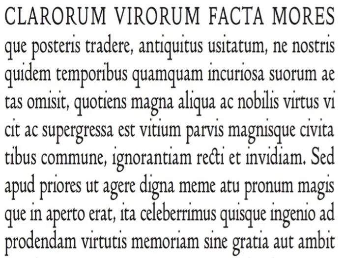
This British font is remembered as much for its simple beauty as its tragic end, the casualty of dissolved business partnership. Identifiable by its “ample space between letters, a ‘y’ that descends without a curl, a ligature connecting ‘c’ and ’t,’ and the bottom bowl of its ’g’ set at an angle.”
“No more graceful Roman letter has ever been cut and cast,” remarked A.W. Pollard, critic.
Doves font was created in 1899 by Edward Prince, who created the font based on drawings of a 15th-century Venetian type. Doves Press used the eponymous font in all of their publications, including the iconic edition of the King James Bible (valued today at $30,000).
However, financial stress caused a feud between Doves Press partners Thomas Cobden-Snadershon and Emery Walker. Thomas dissolved the partnership and Emery claimed 50% of the assets. By that point the only asset of any value was the type. Thomas didn’t want to relinquish control over the use of his beloved font; from 1913 to 1917 he made 100s of secret trips to Hammersmith Bridge, tossing more than a ton of Doves metal type into the River Thames.
In 2014 Robert Green reproduced the digital facsimile of the Doves Type, following 3 years of collecting Doves Press books and hiring an excavation team of ex-military divers to search the River Thames. It is available for purchase from TypeSpec.


