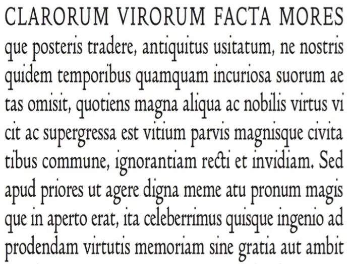
I love fonts. Most have their own history. (A great read on this is Just My Type by Simon Garfield). Throughout my career, they’ve given me an unjustifiable reason to procrastinate on a writing assignment. “What would it look like if I went with Bookman Old Style instead of Garamond?” Until about ten years ago I could name nearly all of them. Now there are just too many.
Why are fonts important for presentations? Typefaces are one of the key graphic design principles. They can easily reinforce the words that they bring to life. Or they can distract us if too many different fonts are used or if they don’t match the message. For example, we wouldn’t use Comic Sans for anything professional and we probably wouldn’t use Helvetica for a wedding announcement. Using a corporate font makes it easier to recognize the source of the information. When it takes our audience less time to recognize something and do less work, we can ask them to use their mental faculties for more important matters.
In the spirit of promoting typeface awareness, I’m launching a Name that Font feature.
Today’s font is Georgia: Created by Matthew Carter in 1996 (or 1993, there is some dispute here), this serif font was commissioned by Microsoft and is considered the “most legible and adaptable screen font” even in low resolution. According to Typedia, “Even at small sizes the face exudes a sense of friendliness; a feeling of intimacy many would argue has been eroded from Times New Roman through overuse.”
What’s your favorite font? Least favorite?


